Have a browse of Jeremy Koreski’s new website, especially the surf gallery: jeremykoreski.com
I first saw the link on Jeremy Koreski’s instagram feed, I recommend following him for some amazing photography, nearly all from icy cold environments, Canada mostly I think, including some great surf shots but also the best fishing photo’s I’ve seen too.
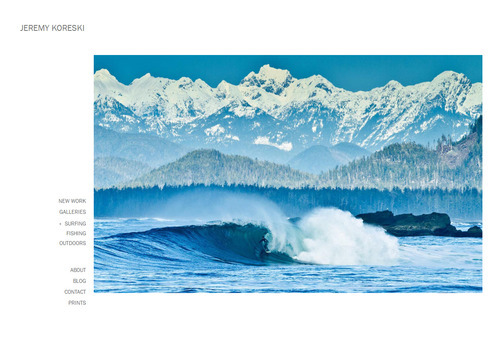
One of the most interesting things to me, beyond the stunning images, were the last two images in the surfing gallery, first you see an awesome pulled back barrel shot with snowy mountains in the background, a glassy but cold looking wave with a surfer standing tall in the barrel.

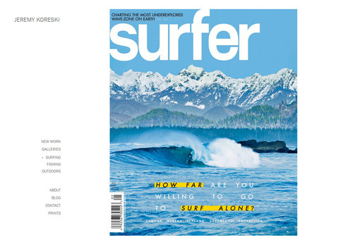
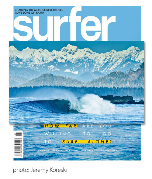
The next image in the gallery is the cover of Surfer Magazine (it’s the May 2011 issue as far as I can tell) which features the shot you just saw.

What always interests me is the way surf magazines deal with the portrait layout when the majority of surf photography lends itself to landscape orientation, of course the inside spreads are ideal on a tall, narrow magazine but the cover is always a bit of a compromise if the original is a long, short photo.
In this case it looks like Surfer have extended the blue sky up and added some more water at the bottom to get the composition right to use this image on the cover. I remember ages ago there was some minor controversy about a composite image of Laird Hamilton being used on the cover of a magazine, I’ve tried to find something about it but my Google skills have not come up with anything yet.
I am definitely not suggesting that this type of simple addition to the original photo is unethical, misleading, or even unusual, I just find it interesting.

Notes on My Photography
The non surf photography influences I’ve been getting into more recently have led me to believe that many of my photo’s could be altered to achieve better composition or just to make sure all the elements came together, rather than relying on the perfect moment just happening.
There’s a lot of material on line about the ethics of photo manipulation, some interesting (start here to read more), most dull. I think surf photography, and sports photography in general, is journalistic and so should strictly present the event as it happened, but you can do a lot with angles and lighting that doesn’t constitute manipulation and still greatly affect how the photo looks.
I’ve experimented with a couple of line-up shots recently where I wanted a big tree in the top of the frame, a couple of people on the beach and a wave breaking close to shore, wherever I put myself I couldn’t quite get the whole lot in shot how I wanted it, I snapped a few different frames from the same place and thought I’d stitch it together afterwards, I haven’t attempted the stitch yet but I think if I can get the compositing right it will look better than any one of the images I took individually.
I think I would be happy presenting the resultant composite as a piece of photo art, perhaps in a competition at the local camera club, but I wouldn’t display it as an example of surf photography for surfers to look at.
Some of the adverts in magazines are clearly photo illustrations with all sorts of obvious manipulation and composition, this doesn’t happen in editorial photo’s but the tools are there if the manipulator is skilled enough to make a very convincing image. Maybe there are some examples out there already, but I doubt there’s many, after all I’m constantly surprised at how otherworldly surf photo’s can look just by using a fisheye and getting a weird angle.
Leave a Reply